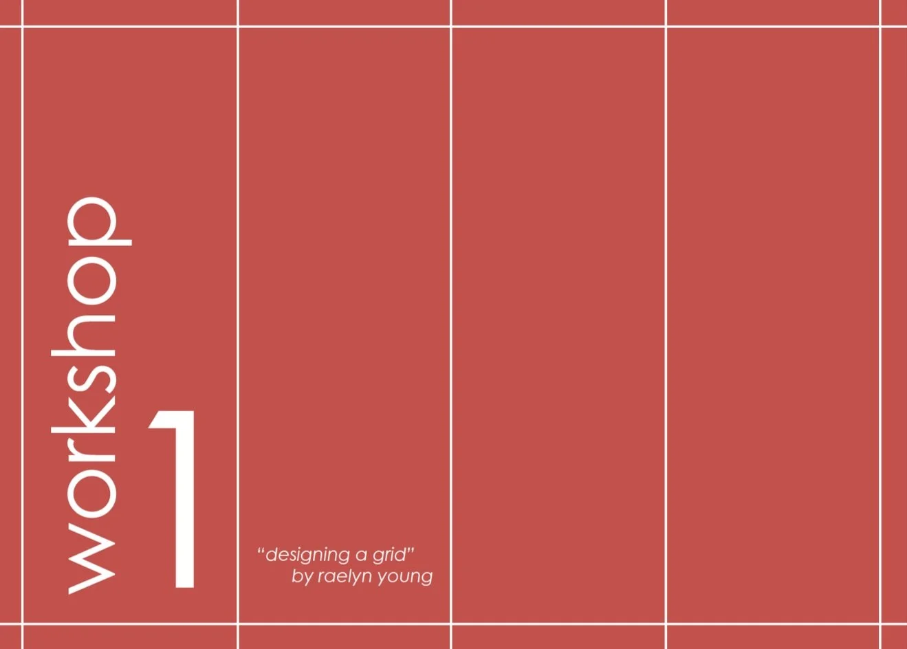
Magazine GRid analysis This project was for one of my Graphic design courses at Boise State where we broke down each section of a magazine and the grid system they follow. My selected magazine was Vanity Fair so I used their four-column grid system when designing the layout of each page. Made in Adobe Indesign and Illustrator. Staying consistent with VF Didot fonts for headlines and San Serif Modern for body text. This project also explores the taxonomy of Vanity Fair, the unity through their design styles, and a compare and contrast of their print vs web designs. Along with diving into a magazine, this project has enhanced my knowledge of how consistency and unity can work through each part the design process.
Project Date Spring 2023
Boise ID + Graphic Design Studio II
Exploring a Design Grid & Page Layouts
Graphic Design Studio II Four Column Grid Workshop 1.
Study of Typographic Styles, Page Margins, and Baseline Grids.
Grid Analysis Page Layout Setup Practice.


